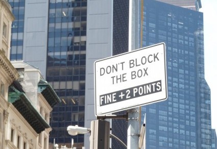
What governs whether a sign-maker has room for letters and punctuation? Font? The size of the sign? I’m going for chaos theory, based on these signs. The first is from the “Dept of Transportation”:
 Somehow “ped” got a period, but “dept” didn’t. Both are abbreviations, “ped” being the shortened form for “pedestrian” and “dept” for “department.” In case you’re wondering (actually, despite the fact that you’re not wondering at all), I should mention that this NYC “dept” isn’t consistent when it comes to punctuation relating to walkers:

Maybe the plural “peds” seems different to the dept? Grammatically, it’s not.
Not only “depts,” but also building owners get creative with punctuation:

Neither of the two sentences on this sign ends with a period. Also, “owners” should have an apostrophe, before the s or after it, depending upon how many people own the bikes. I gave up the apostrophe battle a long time ago, so I won’t dwell on that issue here. I do wonder (a) how the landlord can figure out who owns a bike and (b) exactly how the “expense” is collected. I’m betting this sign is an empty threat. (Also ineffective, given the number of bicycles that have nearly run me down on New York sidewalks. What’s the dept doing with the time saved by ignoring punctuation rules?) I also wonder about the criteria for capital letters in this sign. If standard rules for caps had been in effect, only “No” and “Removal” would qualify (first word of each sentence), as well as the “Ps” in the title, “Private Property.” If the caps were for emphasis, why is “expense” in lower case?
Another:
 I understand that consistency is difficult to achieve in, say, a 200-page document. But if you’re working with only two sentences, you ought to be able to spare a period for each or omit the punctuation mark entirely.
Last but not least:
 Okay, no period at the end of this sentence: I’m used to that. But I can’t find any reason for a comma before the conjunction “or.” For that matter, I can’t find a reason for the text as written. Why not just say “DO NOT FEED BIRDS”? Theories welcome. Punc also.

Oh, the battle we wage against awful signs is lost, don’t you agree?
BTW the Birds sign reminds me of these two short posts of mine –
https://crossedeyesanddottedtees.wordpress.com/2018/03/29/pigeon-patio/
and
https://crossedeyesanddottedtees.wordpress.com/2018/05/05/the-definition-of-irony-part-2/
Enjoy!
xox
Ellie
Great posts, Ellie!