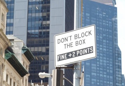
Lest you think that my photographic skills (minimal at best) are responsible for the strange messages on these signs, let me assure you that what you see here is what I saw there, with “there” being New York City. The first was tacked to the inside of a shop window:

Ou: my favorite non-word. An: my second favorite.
Yes, I know what they were trying to say. But isn’t it fun to speculate about the missing letters? First, the OU: “Please visit oubliette” (for horror/dungeon fans). Or “Outback” (for those seeking a restaurant). Maybe “outdoors,” “outlook,” or “outcropping” (for nature lovers) or “outcasts” (for compassionate souls). Now the AN: “self service analgesic” or “anti-venom” (for snakebite victims). Perhaps “analogy,” “Anglican,” “anapest,” or “antonyms” (for English teachers).
I could go on, but I need space for this one:

A rat by any other name . . .
Instead of completing the last word, I choose to see this message as complete. The company caters to groups of rats (semi-) regulated by the SEC. Keep that in mind the next time your boss throws an office party.
I’m not sure how this post appears on your device. When I check new posts on my laptop, they often appear fine. Then, when I see the same post on my tablet, I find extra or missing spaces. Tech devices, for all they have evolved, do not always play nicely together. These signs, however, were printed on paper. There is no excuse for lopping off one edge.
In making your own signs, take care to allow enough room for the whole message. In other words, plan ahea.

Gerri, your pos was so funn I laughed and laughe! Almost fell off my chai
I so look forward to your posts; they make my da
An you commen mad min to.
I knew that the “there” wasn’t Oakland.
I wouldn’t mind a trip to California right around now!
You’ll love it. This afternoon the weather is a balmy 103 degrees.
Wow! Maybe I’ll wait until winter!
Wise move!