Tag Archives: traffic signs

Directionless

Polls show that many of us feel adrift and directionless. I sometimes share that feeling, especially when I see signs like the ones in this post. The first one stands in a narrow opening between the Great Hall and the Egyptian wing of the Met:

Who knew Jean-Paul Sartre made signs for museums?

Here’s a puzzle for motorists:

It may not be evident in the photo, but it should be to motorists, that directly behind these signs is Lake Wallenpaupack. Do drivers really have to be told to turn instead of plunge?

In the same vein:

If you overthink it — my specialty, by the way — the sign asks you to be in two places at the same time. Modern life often demands multitasking, but this is a whole other ballgame, one you can’t win.

You can’t win this one, either:

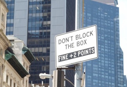
These two signs stand in front of the United Nations. I spotted them a few years ago and have checked periodically to see whether an attack of sanity broke out and someone took at least one of the signs down. So far, motorists are still being told to do the impossible.

As are we all. It seems to me that what really unites nations is this: nobody knows where to go, how to get there, and when to stop. Who knew street signs mirrored life?

Where?

I don’t allow my phone to broadcast where it is and therefore where I am, because I enjoy whatever shred of privacy I can wring from modern life. I do wish, though, that some signs gave better information about location. For example, imagine you’re driving and come upon this sign:

Bay?

A bay can be a coastal indentation that boats bob around in. It can also be a window or a tree, and sometimes the sound of a hound. Digging deep into the vocabulary of public transportation, you find that a bay is where a bus parks to pick up or drop off passengers. But suppose you’re driving a car on a Manhattan street. What are the odds that you’ll slow down to figure out where the “bay” is, or worse, that you’ll spend so much time thinking about the sign that you’ll overlook the red light in front of you? I stood near this sign for a while, watching cars turn left from any of three lanes, plus a bit of another, which was intended for vehicles traveling in the opposite direction. Redefine bay if you please, but please let it be common usage before it hits the streets.

Another location issue:

Curated how?

I’ve held onto this sign since last autumn, trying to decide what the thrift shop is doing. “Curated” implies careful selection. But “curated by location”? I can only imagine a vast sorting area with workers deciding whether a coat is “totally Chelsea” or “too Upper East Side.” If so, I’d like to see the selection criteria. Wait, actually I would not like to see the selection criteria. I gnash my teeth often enough these days.

Which brings me to this, the best statement about location I’ve come across:

Instant karma

I’ve seen several cryptic messages like this one, sprayed around my neighborhood. They take me back to the early days of Keith Haring’s career, when he pasted black paper over subway ads and then drew barking dogs or radiant children. Am I watching the next street artist develop? Maybe. Even if the artist never achieves Haring- or Banksy-level fame, it’s nice to know where karma comes back: in the shower.

Being Patient

Every once in a while a word or phrase snags my mind and pulls my attention away from more important things, like oncoming traffic or melting polar ice caps. This message on a sign in front of a medical pavilion caught my eye and took me away, however briefly, from my worries about the serious illness treated there:


I’ll forgo all the jokes about why “patient” is the appropriate term for someone who waits, patiently or not, to see a doctor. The medical personnel I’ve recently gotten to know have a lot of patients — all of which require a lot of patience. Calmly and competently the doctors, nurses, and staff answer questions, soothe fears, and minister to every ailment, taking as much time as the patient, not the doctor, needs.

So I’ll skip the first word on the sign and focus on the rest of it, which at first offended me. It made me think of a loading dock, where things — inanimate objects, not people — are hoisted onto or off of trucks. How demeaning, I thought. But sick people, to an extent, do take on some characteristics of objects. They’re moved around, often without understanding where or why, because their bodies require attention. The normal dignity of adulthood rightly takes a backseat during illness.  Still, “loading and unloading” seems harsh. No one wants to be viewed as cargo.

But what are the alternatives? My first thought was “pick up and drop off.” That wording is not as bad as “loading and unloading,” but it’s far from perfect. “Pick up and drop off” shows up on laundromats and dry cleaners, UPS stores, and so forth. The phrase still conjures up things, just smaller items like packages instead of larger loaded or unloaded crates. (True, kids are picked up or dropped off, but that fact underscores the loss of independence that adult patients experience.)

Nor do longer phrases work for this sign, because drivers need to comprehend the meaning immediately. For this reason I discarded (dropped off? unloaded?) “Stop here only long enough for patients to get out of or into your car.” By the time a driver comes to the end of that sentence, fifteen cars are lined up behind, horns blaring.  Less common phrases have the same problem. Do you want a driver who’s decoding “disembark” or “alight” instead of flicking the signal lever and easing over to the curb?

Nothing I’ve come up with really works, so I’ll have to live with “loading and unloading.” I’m open to suggestions, though. Write when you have time. I can wait. I’m patient.