Tag Archives: punctuation

Wading into a swamp of uncertainty

To read signs in NYC is to wade into a swamp of uncertainty. Please, dear reader, put on your thinking cap and thigh-high boots. Rescue me from the swamp generated by these signs.

First up: this beauty, which was affixed to the fence surrounding a site associated with the never-ending construction of a new subway:

What kind of location?

What kind of location?


I fooled around with hyphens for a while in the context of this sign. But what’s a “white-hat location” or a “white hat-location”? The punctuation mark solved nothing, because I don’t know the significance of a “white hat,” beyond the traditional (and somewhat racist) idea that good guys always wear white hats. I pondered whether the sign referred to “hard hats,” which are supposed to protect workers from head trauma. But then why not say so? Also, I’ve seen many construction workers wearing hard hats in other colors. Perhaps the hat color is associated with rank, in which case this location is open only to those who have earned a white hat, which, like a black belt in karate, signifies that they’ve achieved proficiency in something (subway building? procrastinating? maneuvering around piles of metal rods and concrete blocks?). Your guess is as good as mine.

Next up is this awning:

What, no candlestick-maker?

No candlestick maker?


I went through the hyphen calculation again with this sign and came up with nothing. If it’s “prime-butcher baker,” is the baker toasting top-notch butchers? Maybe it’s “prime butcher-baker” and the store employs a skilled (prime) person who works on both meat and baked goods. At one point the concept of prime numbers flashed through my consciousness, but I couldn’t link 2, 17, or 983 (to name a few) to the “butcher baker” idea. If any mathematicians have theories, please send me a note.

Last and maybe least is this one:

For tiny cars.

For  cars?


What’s a “reduced garage”? For tiny cars only? A garage with fewer spaces? I thought the sign might refer to “reduced prices” until I took a look at the fees, which, I promise you, were in no way “reduced” unless your standard of measurement is the amount charged to park a car inside a luxury hotel suite (a ridiculous but apparently real offer to billionaires who have abnormal relationships with their vehicles).

I have more, but I’ll wait for a future post. I don’t want to swamp your speculative powers.
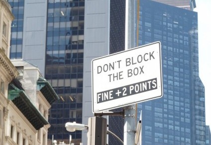
Boxing, New York Style

Manhattan apartments are notoriously tiny, and so are Manhattan closets. So it’s not surprising that during my walks around the borough I encounter many shops offering storage. What is surprising is the nature of that storage. For example:

Legal? Illegal?

Legal? Illegal?


Could be oregano, parsley, or . . . well, I’m sure the DEA would supply a list of herbs that people might want to stash off-site.

And then there’s this beauty:

Put your cold in a box.

Put your cold in a box.

Absent a hyphen, the sign’s meaning is ambiguous. The shop may be offering to store boxes that are low in temperature (cold-box storage). Or, the sign may be targeting sneezers, coughers, and those with similar symptoms (cold box-storage). I know I’d like to stash my ailments at times, especially when I see this sign:

What's free?

What’s free?


I also know, however, that the old adage, “you get what you pay for,” is true. So what’s free: the storage of a box (contents cost extra) or the box (storage charges apply)? I’ll let you know if my kitchen runs out of space and I have to store some herbs, eggs, milk, or anything else.

Stop full stop.

I’m not against periods, the punctuation mark the British call “full stops.” But everything has its place. Traditionally, periods appear at the end of sentences that make statements or give commands. They’re also used in abbreviations. Lately, though, periods have been popping up in odd positions, as in this sign in front of a coffee shop:

And the period is there because?

Why is there a period after “birch”?


The shop’s name is “Birch” — I think. It may be “Birch.” Or is it “Birch. coffee”? And why is the period there at all? Is it supposed to add authority or emphasis? Perhaps the store owner wanted to give a sense of completion, as in “sip your latte here and your life will be complete.” The only thing I know for sure is that the punctuation mark doesn’t indicate a command. (“Hey you! Birch now or face the consequences!) Nor does it end a statement, because there is no statement.

I expect strange things from retailers, but somehow I thought that religious institutions, with help from the Almighty, would do better. At least I thought so until I spied this sign:

This church needs heavenly punctuation guidance.

This church needs heavenly punctuation guidance.


True, this sign contains more words than the café sign, but they don’t form a sentence. The church indeed appears to be “warm, welcoming and beautiful,” but not grammatical.

Nor can you count on the banking system to come to a full stop (in punctuation or in finance):

Two nonsensical, non-sentences appear in one sign.

Two nonsensical, non-sentences appear in one sign.


I don’t expect “pleasure” from my bank. Do you? The “2% cash back” sounds great — but 2% of what? And back to whom? I can’t blame the Great Recession on faulty punctuation, but a lack of clarity in bank communications appears in both. Just saying.

My advice: For a period of time, let’s agree to put a stop to unnecessary full stops. Then we can  decide whether to give this punctuation mark additional duties. That is, “Extra. Duties.”

Massage Tips

The rise of e-tailing has led to the decline of brick-and-mortar retailers. But personal services can’t easily by sent via UPS (or drone, for that matter). You can’t have a haircut delivered to your apartment, though you may — if you’re financially fortunate — have the haircutter arrive at your door for a few quick snips. Fortunately for bloggers like me, personal-service shops abound in NYC, and their signs are as loopy as any other sort, outclassed only by everything composed by the city’s Department of Transportation.

Shop owners who knead body parts for a living may be great at their chosen task, but they’re not necessarily good at advertising. Recently I saw this disturbing claim:

Back-foot?

If your front-foot is sore, you’re out of luck.


This sign would be fine (though perhaps not effective) had it appeared in a vet’s office or a dog spa. But it’s in a salon devoted to bipeds. Grammar note: The hyphen creates a single adjective, a description of the noun “massage.” In this case “back-foot” implies a lead (front-foot) and a follower (back-foot).  I wonder whether a person’s back- and front-feet correspond to their dominant hands. But that is a question for scientists, not grammarians.

Here’s another variation:

What rub?

What kind of rub?


Now there’s no hyphen, just an artistic slant that leaves the meaning floating somewhere over the Land of Confusion . Maybe “back or foot rub”? Or “back and foot rub”? Personally, I like to know which body parts are involved before plunking down my cash.

The moral of this post:

Tips appreciated.

Tips appreciated.


Not a gem of clarity either (“waxing massage”? “facial tips”? “waxing facial”? “massage tips”?), but, dreamer that I am, I choose to believe this sign refers to a veteran masseuse, eager to impart wisdom garnered over decades to newcomers to the profession.

Maybe even a few tips about hyphens.


The most unkindest cut

Shakespeare’s Marc Antony was onto something when he referred to Brutus’s stab at Julius Caesar as the “most unkindest cut of all” – something that  this New York City barber seems determined to avoid:

Nice to know they're kind to senior citizens and kids.

Nice to know the barber is kind.


I wasn’t able to determine what the gray tape covered. Perhaps it was “except when we’re annoyed” or another disclaimer? And is that where the little red dots come from – scissor stabs?  Regardless, I do prefer “kind cuts” from my salon, and I’m sure you do also. I am a bit upset by the lack of apostrophes, which create a warning that “senior citizens cut” and doesn’t explain whether old people with scissors make “kind” or cruel stabs and slashes. No guarantees after 65, I guess. At least when “kids haircut,” the only possible victim is a tress.

I can’t leave this sign without asking whether anyone knows what a “tape-up” is. Maybe something to do with the duct tape near the top of the sign? Nor have I a clue about the definition of “skin fade.” I’ve seen odd (to me) stubble-on-a-scalp looks, but wouldn’t those be “hair fades”?  And does “shape up” command you to finally get serious about dieting and exercise? Theories welcome.

Don’t Mess with a Grandma

I more or less gave up on apostrophes a long time ago. There seems to be a cosmic jar filled with this punctuation mark, which writers shake over their texts, letting apostrophes fall willy-nilly into words. Thus I ignored this sign, which shoves an apostrophe into a plural, where it does not belong:

Tuesday's. Sigh.

Tuesday’s. Sigh.

Some grammarians call this usage a “greengrocer’s apostrophe.” (Notice the correct use of the possessive apostrophe in the term, which names a punctuation error.) Why “greengrocer’s”? My opinion, based on no research whatsoever, is that people who use this term believe a shopkeeper (greengrocer) is more likely than a non-business owner to insert apostrophes into plurals. That belief doesn’t match my experience. If I stacked all the student essays, term papers, and other writing I graded and corrected during my teaching career, the top of the pile would be within spitting distance of the moon and maybe even topple over onto a moon rock or two. Nearly all of those writing efforts included a “greengrocer’s apostrophe,” and none of the students were grocers, though many were (environmentally) green.

Though I scarcely glance at extra apostrophes, I did stop short when I saw this sign:

Granny

Granny’s combative.


The color difference between the first and last pair of lines initially led me to believe that the tavernkeeper was making a statement about grandmothers and their alleged capacity to slug someone. But I’m a grandmother, and though sorely tempted at times, I have never punched anyone. Then I noticed that no punctuation appeared anywhere at all. Perhaps the sign is a statement about grannies’ tendency to wallop cocktails, I mused. (Sidepoint: There are hot cocktails? Who knew! ) The image of grandmothers bopping martinis, mimosas, and other drinks made me wonder whether a new temperance movement was brewing. I still don’t know what the sign means. Just to be safe, I have one piece of advice: Don’t mess with a grandma, especially when she’s drinking.

Air, Scare, or Simply There

My almost-seven-year-old granddaughter has recently discovered air quotes, the curly-fingered gesture that encloses spoken words in quotation marks. To make an air quote, you bend the pointer and middle fingers of each hand a couple of times, and whoever is listening or watching is supposed to know that you’ve distanced yourself from whatever you’ve just said.  Air quotes are the bodily equivalent of scare quotes, the punctuation marks in written material that separate the writer from the quotation, as in don’t blame me for this dumb opinion or yeah, like I believe that. Both scare and air quotes are gestures of irony or sarcasm. Usually, that is. During my first year of teaching about a million years ago, I used air quotes to tell the class that I was quoting from a text, not using my own words. I didn’t find out until June (June!) that the kids perceived a particularly nerdy wave, not a punctuation mark. Sigh.

My granddaughter tosses out air quotes with abandon. (“I’m ‘nice’ and so are you,” she’ll say with active fingers, meaning that she and I are actually “nice.”) She enjoys the gesture more than its significance. No problem. She’s little and deserves time to experiment. I’m not sure the creator of this sign should receive the same leeway:

Come again?

Come again?


I snapped this photo during New Year’s weekend, when this store and everything around it was closed for celebration or recovery from celebration. I’m still not sure what it means. Is the shop expecting a door bell delivery? Is someone hiding out inside, waiting for a package and not coming forth until the door bell rings? Does the shop owner know that the door bell is broken and “door bell” is a useless phrase?

I’m sure the letter carrier or package deliverer liked the John Hancock squiggle under the last line. I’m also sure that everyone reading this sign pressed the door bell, just to see what would happen. (I did. Nothing happened.) But that’s it. I’m sure of nothing else – certainly not the meaning.  The sign is a mystery. Or maybe I should say a “mystery.” Your theories are welcome – really welcome, not “welcome.”

Please tell me . . .

Please tell me that two apostrophes are missing from this sign, and not the verb “are.” Even though it’s unlikely that Fido and Mittens can read, I’d also be happy with direct address, created by a colon after “cats”:

P1010982


Please tell me that the employees of this store are not making neat rectangles out of little humans:

Fold how?

Fold how?


I understand the “wash” part, as I subscribe to a theory I discovered in an Angela Thirkell novel: that kids are born with a bag of dirt inside that leaks out little by little, beginning anew every time they emerge from the bathtub. But the rest is a mystery. Fold? Doubled over at the waist, or vertically from left to right? Also, what’s with the “n”? Why use this contraction of “and,” which is more a grunt than a word? Maybe the workers are too busy bending kids’ hands and feet (and then keeping the limbs in place) to add the missing letters? And what’s the market for folded babies and toddlers? Okay, as an experienced mother and grandmother, I can actually answer that last question. After a long day chasing little kids around, having someone fold them neatly is, unfortunately, appealing. Wrong, but appealing.

Of Mice and Man

Okay, I lied. This post is about man as a singular form. No mice appear. To be clear, mice appear regularly in New York City, but this post is mice-free. Instead, this post is about man-ly signs:

One guy does everything.

One guy does everything.


The construction manager must be on a tight budget if only one man is on the job. No wonder there’s danger! I’d cause all sorts of danger too if I had to do all the work myself. (Oh wait – I do have to do all the work myself, but no one ever got a concussion from a dangling modifier.)

Here’s another:

Man and Ladies.

Man and Ladies.

To be fair, this sign should read (1) Gentleman and Lady or (2) Gentlemen and Ladies or (3) Men and Women. Or, judging from the fact that nearly every garment on display in the shop is a business suit typically worn by a man, the sign could also change to Men and Woman.

One more, from an earlier post:

This store sells clothes for one kid. Just one kid.

This store sells clothes for one kid. Just one kid.


The placement of the apostrophe signals a singular noun, so the store sells to one kid (no word on the gender). With such a limited market, I’m not surprised that the store is now out of business.


Don’t blame me!

Harry Truman kept a sign on his desk in the Oval Office declaring that “the buck stops here.” Harry’s acknowledgement of responsibility is, unfortunately, not trending right now. Instead, blame-shifting is on the rise. Take a look at this sign, taped to the door of a major telecommunications company:

Management's to blame

Management’s to blame


It’s worth noting that in front of the door is a single, short step. We’re not talking stoop here, or terrace, or anything other than the standard dirty, cracked, Manhattan sidewalk and what might reasonably be termed a ledge.

Some questions arise:

(1) Given the exorbitant rates for cellphone service, can’t the company afford a professionally printed sign? The morning I snapped this photo the paper was taped flat, but by the afternoon, the edges had curled up. Should I worry about network maintenance if the company can’t pay for a real sign?

(2) Has the property management been walking in and out of the building every day, tripping over passersby who sat on the ledge – er, I mean step? This building is near my home, and I’ve seen people sitting in front of it only once. On folding chairs. Striking workers tired of picketing, they weren’t barbecuing, just passing around sandwiches, listening to music, and generally having a fine old time. When the strike ended, everyone went away. Why the sign? Fear of copycat tailgating?

(3) Who is property management? The building, a giant windowless pile of brick, has been a telephone-company outpost since the dial-up era. Yet the sign appears to deflect responsibility to a nameless management. Maybe the person who printed the sign wanted backup authority? It’s not just me, a lowly secretary, who forbids you a seat. It’s them. Pay attention. Or should I say, ***ATTENTION***?

This don’t-blame-me sign is one example of a common type:

The manufacturer's to blame!

The manufacturer’s to blame!


The sign implies that you pay what the manufacturer demands, and not a penny more. The store owner takes no profit. The rent is a charitable contribution, as are the utilities and staff salaries. Right?  Or, perhaps the store has ceded its pricing authority to the manufacturer, who applies an algorithm that includes the store’s expenses?  Either way, it’s don’t blame me.

A variation on this theme is “lowest prices allowed by law.” I see this phrase on signs atop cigarette racks. Does this statement mean that the store gives you the smokes for free, except for taxes it merrily sends along to the state, city, or wherever? Doubtful.

That’s it for now. If you want more examples, you’re out of luck. I don’t write the signs. I just post what appears. Don’t blame me.