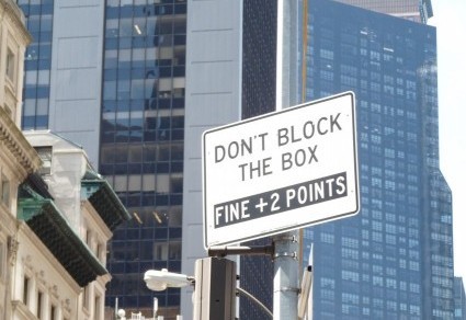
Tag Archives: confusing signs

This Is Not a Post

It’s a promulgation, the fanciest near-synonym of post I could find. Fancy, by the way, is today’s theme. Here’s a paragraph from a catalogue mistakenly delivered to my mailbox:

I leafed through the catalogue but didn’t notice any serpentine candlesticks or large-scale hummingbirds (and I definitely wouldn’t buy any if I did). Instead I focused on expressive materiality, which means . . . well, what does it mean? I’m thinking quadruple pricing, but maybe that’s just me.

Onward and upward to this sign on a recently completed apartment building:

To protect the guilty, I try not to include company names, but I will tell you that the building has “Manor” in its name, a word equal in snootiness to Sculpted in Stature. All sorts of construction machinery littered the site for a year or so, but no stone-sculpting tools with which to carve Stature. And how does one carve Stature? Does that even have a meaning?

Skip the misspelled word on line three and go directly to the fourth line of this sign:

All this to describe paint! If only one person is making it (the sign says craftsman, not craftsmen), small wonder that the product is made only in small batches. Then there’s formulation and curated collection — words I reckon cost an extra hundred each, per can. Or jar, or whatever they sell curated paint in. Grecian urns? Space capsules? Something expensive, that’s for sure — unlike this completely free promulgation about snobbery.

Oxymoronic

I’m tempted to drop three letters from this post’s title when I contemplate these photos. First up is a label on a pair of jeans I bought this weekend. (Those aren’t bullet holes, in case you’re worried, but rather the remains of the label fastener.)

The jeans fit fine, but I still don’t know what to make of the product description.

Next up: the front and back labels of some shampoo my friend Catherine bought for her cat, Lionel:

So far, so good. Apples and honey sound pleasing, though I don’t know whether these ingredients appeal to cats. Speaking of ingredients:

As I’m sure you know, ingredients must be listed on labels in order, from most to least. Question for the manufacturer: What’s the main ingredient in your waterless shampoo? Answer: Um . . .

I snapped this one a couple of years ago:

Sidewalks inside? And they cost only $10? Even allowing for inflation, that’s a pretty good deal.

Oddly Specific

I usually gripe about vague signs, but today I direct your attention to some oddly specific notices, such as this one:

I’m not hugely surprised that dogs are excluded, because an expanse of lawn (in this case, a soccer field) would be a nice place to let Fido off the leash. But would people actually take cats there? If so, I’d like to know how they get a leash on a cat without incurring stitches for the leasher and the leashed. And what’s with the pot bellied pigs? If I were an iguana or a llama, I’d feel left out by this sign. And if I had a pot-bellied pig, I’d never exclude the hyphen.

Another exclusion:

Do I have to point out that ice cream is, in fact, food? For some of us, it’s a major food group. Also, why single out ice cream? Was this store owner once traumatized by mint chocolate chip? Struck in the eye by a cone of rocky road? On a diet?

At least the comparison is logically correct in this sign:

I do wonder about the comma. Grammatically it’s not necessary (some would even say it’s wrong), because the conjunction or doesn’t connect two clauses. To me, the comma sounds a bit defensive: I’m not anti-pigeon! I’m anti-other birds too!

One more bird (sort of), courtesy of my friend Catherine:

This image has an empty alt attribute; its file name is cat-food-Catherine-e1633093629444-350x260.jpg

So glad the label is clear! Now I know that I’ll have to shop elsewhere for outdoor chicken.

Directionless

Polls show that many of us feel adrift and directionless. I sometimes share that feeling, especially when I see signs like the ones in this post. The first one stands in a narrow opening between the Great Hall and the Egyptian wing of the Met:

Who knew Jean-Paul Sartre made signs for museums?

Here’s a puzzle for motorists:

It may not be evident in the photo, but it should be to motorists, that directly behind these signs is Lake Wallenpaupack. Do drivers really have to be told to turn instead of plunge?

In the same vein:

If you overthink it — my specialty, by the way — the sign asks you to be in two places at the same time. Modern life often demands multitasking, but this is a whole other ballgame, one you can’t win.

You can’t win this one, either:

These two signs stand in front of the United Nations. I spotted them a few years ago and have checked periodically to see whether an attack of sanity broke out and someone took at least one of the signs down. So far, motorists are still being told to do the impossible.

As are we all. It seems to me that what really unites nations is this: nobody knows where to go, how to get there, and when to stop. Who knew street signs mirrored life?

The Favor of a Reply Is Requested

I have a few questions for you, starting with your thoughts on this advertisement for cigarettes:

Is this company trying to corner the health-food market? Organic says yes, but tobacco seems to undercut that message.

I gnashed my teeth when I read this label on a bottle of mouthwash:

What does less intense enamel taste like? Does the enamel on your teeth have any taste at all? I don’t think mine does.

I’ve held onto this photo for a long time — not for an entire historic era, but for a year or so:

Does climbing or descending these steps change history, altering the timeline or plunging the world into a different branch of the multiverse? Maybe the steps have fallen into disrepair and the homeowner is using historic as a get-out-of-being-sued excuse? Attention, attorneys: Would this hold up in court if someone did sue?

Now to a Seattle parking area:

Is the sign on the right intended to help firefighters? Somehow I thought they were supposed to notice things like hydrants without assistance from signage. Maybe some drivers back out without looking. If so, is there a way to revise the driving test to exclude them? I’m really hoping the answer to that last question is yes.

I also eagerly await your theories.

Apostrophes, Sigh

What is it with apostrophes? They show up when they aren’t needed and go AWOL when they are. Here’s an example from the first category, in a blurry photo I snapped from a moving car:

Unless the HOUSES & LAND belong to a man named JOHN BUY, this apostrophe interrupts a perfectly good verb.

Another unnecessary apostrophe, in the plural noun Mondays:

Whoever made this sign tried a tactic I’ve often seen students employ: miniaturizing the punctuation mark. The student hopes that if the word needs an apostrophe, the teacher will see one, and if it doesn’t, the teacher will see an untidy smudge. I should note that hedging a punctuation bet this way never works, in class or in signs.

Now for the AWOL Department. This sign, in an elevator serviced by a major airline that should know better, lacks an apostrophe:

There are more problems with this sign than writing FIREMANS instead of FIREMAN’S. First of all, I sincerely hope that more than one person would respond to a blaze in an airport. A blaze anywhere, for that matter! Thus I have a problem with FIREMAN, a singular noun. Second, the sign has a gender problem. If I were a FIREFIGHTER (a more accurate and inclusive term), I’d be tempted to thwack this sign with my extinguisher and put a dent in FIREMANS.

This one is in a category all by itself:

I wonder what sort of goals a numeral can have. Does 1 aspire to become 2? Aim for 10? Perhaps 1 aspires to a fancier font?

Maybe there’s a 1 somewhere in the world striving to curtail gun violence. I can get behind that last goal, for sure, and you probably can, too. If only the shop displaying this sign could help us refine that goal and create an action plan. That would undoubtedly be in EVERY 1’S best interest.

Quality Time

How do you judge the quality of something you’re purchasing? By listening to friends’ recommendations, checking online reviews, reading tea leaves? Perhaps you place your trust in signs — not omens, but actual signs, such as this one:

This may be the workplace of a superb tailor, but I object to the phrase one of the best. What does that mean, exactly? One of the best on the block? (That’s likely, as it’s the only tailor on the block.) One of the best in the neighborhood? There might be some argument about that. In the country? The world? The universe? (Hey, if there can be a “Miss Universe,” there can be a “Best Tailor in the Universe,” too.) However vague the claim may be, the store has guaranteed it. It would be interesting to see a dissatisfied customer try to collect!

I had to check the dictionary for this next statement of quality, painted on the side of a van. I usually hide company names when I post signs, but in this case, the name is part of the point.

WE STAND UP TO OUR NAME! When I read this sentence, I pictured someone from the High Definition Cooling Company with hands on hips, defiantly facing the name because . . . well, what does a name have to do to motivate workers to stand up to it? Unable to think of a plausible scenario, I turned to the Oxford English Dictionary for other definitions of stand up to. I found “remain firm in the face of” (stood up to a strong wind), “pass a test” (stood up to close examination), and “rise for a purpose” (stood up to dance). I confess I can’t make any of these definitions work.

Nor do I know what this sign means:

Returning to the OED, I read that uncompromising means “not willing to seek compromise,” “stiff,” “stubborn,” and “unbending.” Okay, the signwriter is touting a style and quality that will not change. But what sort of style and quality does the product have? If it’s an ugly style or a poor quality, most people would prefer a little compromise. I would, and in that spirit, I welcome alternative interpretations of these signs and of the style and quality of this post.

Quiz Time

Why? Such a simple question. Unfortunately, the answer may be anything but, especially when it comes to signs, as in “why did they write that, in that way?”

My friend Amy sent this photo:

There’s some punctuation missing from the sentence beginning with wildlife. A comma after area would directly address wildlife, telling them to be cautious. That interpretation gives rise to two questions: (1) Aren’t wildlife instinctively cautious? and (2) Can wildlife read? Another possibility is that a colon went AWOL from its spot following area. Reinsert it and the sentence becomes a command to be cautious, addressed to whoever is supposed to STAY OUT. That’s more logical but probably ineffective, because some forms of wildlife (the human variety) are capable of interpreting a simple prohibition as a dare. Side point: can somebody please explain the rationale behind the capital-letter and period distribution?

I spotted this sign in a botanical garden on the east bank of the Hudson River:

The Shop is stocked with unusual items, and I’m always interested in checking out a sale. I didn’t buy anything during my visit, though, because I spent my time wondering why at is italicized. Also, why at? What’s wrong with The Shop in Wave Hill or The Shop of Wave Hill? Even The Shop for Wave Hill makes sense, as this is a nonprofit.

My friend Jacqueline found this message in a fortune cookie she cracked open after dinner at (unitalicized!) our favorite Chinese restaurant:

She pointed out that what is right and what you should do are generally supposed to be the same thing. Right?

I welcome your theories about (or for, on, or even at) these signs.

Surprise!

When I snap photos of signs, I am frequently amused and often puzzled. Seldom am I surprised, but occasionally . . . well, take a look.

I saw this sign at a construction site in Seattle, where on average it rains 149 days a year and where the news media keep headlines like “Heavy Rains Bring Floods” ready to roll:

Even though Seattle has not escaped climate change (no place has), it’s still startling to think that someone needs to rent rain there. Also, quick question: if you rent rain, how do you return it when the lease is up?

This sign left me dumbfounded:

There may be a connection between preschool children and beloved dog/dogs, but I’m not seeing it. Thoughts, anyone?

Bureaucracies are generally boring, but Seattle’s Department of Construction delivered this surprise:

I don’t know about you, but I still don’t have an answer to the question What is it? Whatever it may be, don’t look there for units or parking.

Last one, courtesy of my friend Barry:

I can understand banning smoking, but poets? True, the average poet makes, as Calvin Trillin once remarked, “in the high two figures,” but that situation would seem to be covered by an income minimum, not an art form. Maybe someone walked out of English class with Post Traumatic Sonnet Disorder?

If you run across any surprising signs, please feel free to let me know.

Got That?

In this blog I often call attention to signs that omit essential information, thereby forcing readers to guess the intended meaning. These beauties have the opposite problem: desperate to be clear, they overexplain and complicate what should be a simple message. Here’s one I saw taped to a salon door:

I considered having my hair cut, but I couldn’t figure out how to get inside.

Here’s another sign, courtesy of my friend Don:

Note to potential customers: count heads before you enter this establishment. If it’s two, you’re fine, because that’s fewer than FIVE (3). If it’s three or four, enter at your own risk, because you’re in the gray area between the spelled-out number FIVE and the numeral (3). If there are five customers present, try again later, perhaps after snacking at this fast-food restaurant (photo supplied by my friend Jesse):

I don’t mind splitting a burger, but I do mind splitting myself to order a burger. I prefer to use just one lane, not both, when I’m selecting a meal.

As a belated celebration of Valentine’s Day, I can’t resist including this sign:

I get what the sign is saying. What baffles me is the intended market. Are there enough couples wandering around Manhattan, wondering how to elope? How many walk-ins does this store get? My guess: FIVE (3) a year.