Tag Archives: confusing signs

Traffic Favorites

During the holiday season “clip shows” pop up, presumably to give those involved in creating them some time with their families. Grammarian in the City is no different. I’ve just returned from vacation, where I occasionally snapped photos of ridiculous signs for use in future posts. While working through jet lag, I’m recombining bits of old posts of some of my favorite traffic signs, such as . . .


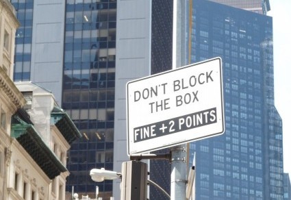
The word “oxymoron” was invented for situations like this one — especially the last two syllables, which are reserved for the sign-posters, who want you to stop and not stop at the same intersection — which, by the way, is in front of the United Nations, where contradictory statements occur with some regularity.

And then there’s . . .

If you’re a truck needing Weight Watchers, you can drive on this street as long as you don’t get an “overweight permit,” which I presume is some sort of legal document. Thus this sign tells you to break the law or stay off Park Avenue.

And for those of you who drive taxis . . .

From this sign I assume that taxis with more than one passenger can go anywhere, but if your destination is above “46 St” or you have a crowd in the back seat, you’re out of luck.

Holiday Shopping

Judging by the signs I’ve spotted recently, merchants are hoping you’ll purchase fashionable holiday attire — for your furniture. An example:

Surely you weren’t planning on ushering guests into a room with a naked table! A four-legged pair of jeans would do nicely for a hip, can’t-be-bothered-to-dress-up dinette set. An evening gown with a very wide skirt saves formal hosts from the embarrassment of an underdressed eating surface. No hint from the shopkeeper about what sort of “table clothes” are available. If the customer isn’t pleased with the styles on sale, “sheets” could possibly preserve the table’s modesty.

Sheets, by the way, seem to tangle when they encounter signs, much as they do in a washing machine:

My bed has lumps, but no bedbugs or a single  “pillow sheet.” How about yours? Maybe a “pillow sheet” would be a good gift.

Still in the linen closet, I’ll move on to the next sign, trying not to cry that the apostrophe rule has crashed and burned once again:


The apostrophe give a sheet possession of the “sale,” which, judging by the price but not the quality of the merchandise, is a pretty good deal. Why is it that so many people persist in thinking that an apostrophe creates a plural? Theories welcome.

I’m obviously stressed about punctuation, and this sign didn’t help:

The bullet point in front of “house” was odd because there were no other items on the sign, hence no bulleted list. But if I’m opting to tinker with punctuation, I’m going for a comma after “house.” That comma would create a direct address statement appropriate to this holiday season:  “House, hold items [so I don’t have to].” See? Shopping-stress relief!

Enough grammar quibbles. Focus on what’s important about Thanksgiving and other holidays:


Do what the sign says: “Enjoy you holiday.”

The Next Logical Question

A challenge of writing is to distinguish between what’s in the mind and what’s on the page, or, in the case of this blog post, on the sign. No doubt these sign writers thought they were expressing themselves perfectly, but each left me with at least one unanswered question. For example:


Unanswered Question: What do the “gas leaks” say?

I should note that a little punctuation would have gone a long way. A question mark after “leaks” and a period or exclamation point after “us” would do nicely here. On the other hand, clarity may be overrated. I did spend an enjoyable quarter hour thinking up possible dialogue:

COMPANY: Good morning. How may I help you?

GAS LEAK: Hiss …sss … sss.

Longer but not clearer is this one:


Unanswered Questions: Why do “pearls” (plural) outnumber “diamond” (singular)? And does the shop really grind up precious gems? Most important: Does anyone working in this shop actually know what these facials are?

Once again I’m struck by the number of nonsense words employed by the “beauty” industry. I read a Sunday NY Times feature on skin and hair care for several weeks before I realized that it was not, in fact, a parody. Moving on:


Unanswered Questions: How many passengers need a DNA Kit? Can’t they check their genetic heritage at home? Does the transit authority seriously believe that a robber will stand still long enough for a cheek swab?

The difference between “may be” and “is” seems significant, but I can’t quite figure out why. My best guess is that the MTA wants you to know that they are not necessarily watching but they are always ready to roll when it comes to your genes. Last one:

Unanswered Question: What happened to the candlestick maker?

I did toy with the idea that the “butcher” chops up a “prime” number — not into factors, but maybe into pieces, like severing the top circle of an eight from the bottom. That interpretation leaves out the “baker,” who may bake less than prime quality bread and cake. Perhaps that’s why the candlestick maker quit.

Calling All Creatives

Words slide from one part of speech to another all the time. How else could I meet some Yankees (noun) or watch Yankees baseball (adjective)? Nor is it rare for words to pick up new and fanciful definitions, though I confess that the first time I see the unexpected, I tend to assume the writer is wrong. Alas, pride does indeed go before a fall, because often I am wrong and what I thought was an error turns out to be a creative expression or a specialized usage.

Are these sign-writers visionary, knowledgeable, or grammatically inept? I’ll let you decide.

Man shirt?


The usual expression is “men’s shirt” or, in an apostrophe-stricken way, “mens shirt.” “Men’s” with the apostrophe is a possessive noun. Without the apostrophe it’s a mistake.  “Man shirt” turns “man” into an adjective. The dictionary allows for “man” as a noun (the man at the counter), a verb (to man the barricades) or an interjection (Man! That was awesome!) True, I don’t flinch at “man cave” (not at the wording, anyway). Perhaps the sign-writer didn’t want the correct but trite “men’s shirt.” But how to change it? “Male shirt” endows the clothing itself with gender.  “Shirts belonging to men” is too long and often inaccurate, as lots of people who aren’t men like the button-down look. “Masculine shirt”? That seems to rely on outdated stereotypes. Maybe “man shirt” isn’t so bad after all.

Moving on:

In my ignorance I was ready to impose an “unauthorized part of speech” penalty — until I looked up “creative” in the dictionary, which enlightened me to the fact that “creative” can be a noun applied to people who, well, create for a living: writers, artists, composers, and so forth. Apparently I’ve been a “creative” for decades and never knew it.

Last one:


“Availability” as a noun is pretty common, but usually in the abstract sense: “Her immediate availability makes her the ideal candidate for Fire Warden, because two million acres are aflame and another million at risk.” But every dictionary definition of “availability” begins with “the quality of” or “the state of,” not “the place where.” On the sign, “availabilities” is a stand-in for “property you can rent if you have enough money.” (A little research into real estate prices showed me that “availabilities” are more expensive than “space for rent.”) Before I leave this sign, I have to address the meaning of “RSF.” I found a site listing 53 meanings for this acronym. I scrolled past “Royal Scots Fusiliers,” “Resource Selection Function,” “Rivista di Studi Fenici” (Journal of Phoenician Studies) until I arrived at “Rental Square Feet,” which seemed more apt than Scots, ecologists, and Phoenicians.

This whole post, by the way, arose from a New York Times article that quoted the phrase “negative effectives” from a judge’s decision.  Given that an “effective” is a “soldier ready for battle” and the ruling was about the military, the phrase might have made sense. Sort of. Then I checked other papers, all of which referred to “negative effects.” Sometimes a “new usage” isn’t creative or specialized. It’s just a typo.

Moral of the story (and note to self): Check before you scoff.

Sspeling Erorrs

I don’t usually bother with spelling mistakes, but when they appear on expensively produced ads, it seems to me that someone should have proofread before printing. Or before handing the finished product over to the customer. Or, at the very least, before hanging the sign on a store window, truck, or sandwich board.

Whether to double a letter or not seems to attract (atract?) errors like iron filings to a magnet (fillings to a magnett?):


Does this shop offer feline treats (mice, catnip, permission to snooze on a sofa that’s usually off-limits)? Or does the store host gossip fests, where guests can be as catty as they please?

Maybe the shop that does “cattering” should lend one of its Ts to this food cart:


I leave aside the issue of eating lunch at 10 AM or 4 PM, given that New York is the city that never sleeps and meals roam around the clock dial like sleepwalkers in a kitchen. Nor will I focus on the random capital letters, though I can’t help wondering whether lunch Time is supposed to reflect the eternal nature and importance of Time or whether the expression refers to a magazine. Instead I’ll confine myself to the meaning of the first line. Is the food cart offering to have the employee in charge of placing rice on the plate accompany you while you eat? And is Free Can Soda a call to action? I do like that sm matches content to form. The abbreviation sm is indeed small.

I don’t want you to think that whether to double the letter T is the only problem out there. S comes with stress in these signs:


Had I a marker and not an aversion to graffiti, I’d remove the extra S from “tresspassingin the second sign and add it to kind in the first. While wondering whether the second sign banned a hair-exchange app, I’d also delete the extra f from proffessional  or get rid of the word entirely. I mean, who else works in a tailor shop? Amateurs? Hobbyists? Not for those prices they don’t.

Now if only these stores would shell out a little cash for some proffessionnall prooffrreadding.

Dumb Questions

One day when I was teaching ninth-grade English, a student approached me during a test. “When it says ‘answer the question’ should I answer the question?” I mention this incident, which sits in my memory bank right next to the time a senior wanted to know whether the government had a “suppository of documents” nearby, because I ask some pretty dumb questions, too. Such as . . .


Doesn’t number two on this list — “imported & domestic items” —  include everything ? If so, why not just say “everything”? And does the customer have to choose: “I want domestic items only, please” or “If it’s not from here, I’m buying it”?

More dumb questions:

“Your portrait painting here”?


Does “your portrait painting here” mean that you and Abe are in it together? Does he stay the same size while you’re squeezed into the upper left corner? Why write “portrait” and “painting”? Isn’t that overkill, like the “oral mouth care” ad I heard on the radio recently?

Dumb Question #3:

Is the price “around 50 cent”? Why not give an exact price? And why not “cents”? Is a rapper in the vicinity? I won’t ask who’d buy wings “all day and night” because this is the city that never sleeps, and that sort of schedule leads to interesting dietary habits and, possibly, the omission of crucial punctuation.

Last one:

Do you call the front desk for “boom service,” and if so, how much do you tip the guy who lowers the boom?  How do you delivery a “jobsite”? And what does a “boom service” showroom show?

Inquiring minds want to know.

.9 Children

No, the title is not a typo. The US Census reports that the average American family has .9 children. When you remove childless families from the calculation, the average number jumps to 1.86. I know at least some math, so I’m not questioning the silliness of .9 or 1.86 kids. Statistics and real life don’t always mesh well, though I do wonder what a .9 kid would look like.

I am questioning absurd signs, such as this poster advertising acting classes:


“Classes for 0 – 18 years.” How, exactly, do you teach a zero-year-old? Have the mother give birth on stage? I thought I was in favor of arts education for all, but now I realize that I’m in favor of arts classes for most. I draw the line a teensy bit higher than zero years.

Another interpretation of this sign revolves around how long the classes run. If you’ve been in class for 18 years, I assume you have an Oscar, Emmy, Tony, and every other performing arts trophy. I also hope that somewhere during those 18 years, you had a coffee break and a restroom excursion or two. The question arises: Who would sign up for a class that meets for O years? Probably someone who wants to say “I studied acting” but doesn’t want to go to class. In my teaching career, I met a fair number of kids in that category.

The next population statement is from a clothing store:


One wonders if this is a sociological statement. One also wonders why the adults are singular (“Man,” even though there are 2, and “Woman”). For the sake of parallelism, the English-teacher term for balance and uniformity in a list, shouldn’t it be “Kid”?

Same store, different aisle:


The parallelism problem is still present, but the numbers make more sense. If the average family has .9 children, the “-1” could work, unless you’re addressing the average number of children in families that actually have them (the most likely buyers of kids’ clothing), in which case the sign-writers should reference the 1.86 average and maybe go with “1+” or “I-ish.”

I’m not going to analyze the “2 Man, 1 Woman” issue presented in both signs. Seriously, I’m not even going to mention it. But I will show you this sign:

Aside from parallelism — you shop for gear for “kids” (plural) and “baby” (singular) — it’s a relief to know that the kids and baby are inside, not in the middle of Third Avenue’s perpetual traffic jam.

I’m off to look at photos of my two (a whole and completely logical number, I must point out) granddaughters. Have fun with your .9 (or 1.86 or however many) kids. Or just enjoy this autumn day.

Last to come, first to go

A friend recently reminded me that prepositions are the “last to come and first to go” in language learning or retention. As someone who’s often placed a “por” where a “para” should be while speaking Spanish, I agree. Which leads me to the conclusion that the people creating these signs are still on their way toward mastery of English. An example from a tailor:

Note the poinsettia in the background, which presumably enjoys regular pruning and an occasional nip of fertilizer. After all, this shop brags about “all work done on our plant.” If the poinsettia isn’t the point, the preposition “on” should be “in” or “at,” explaining that the work (whatever it  might be) isn’t contracted out but performed by the business itself in a factory — “our plant.”

Sometimes an “on” is present where it shouldn’t be and absent where it should be:

According to the dictionary, “premises” are buildings and the land they stand on. The conventions of English allow you to be “on” land and “in” a building. The preposition, therefore, should be a toss-up, and both “on” and “in” should work. But that’s not the case.  I can’t  come up with a reason why “in these premises” sounds odd. “On” fits better here. It just does.

And now a sign from a photography studio:


“In to” or “into”?  “Into,”  with logic behind the choice. The single word “into” shows insertion, which is what the sign warns against. The two-word version implies separate actions, going “in” and then “to” some particular place: “Go in to your friend and apologize,” said Mary standing on the lawn and pointing to the house.

One more:


You can’t have “business with” a property, because “with,” to my mind, implies a person dealing with whoever enters the service entrance. I imagine that the sign should read “on the property.” But who knows? The US Supreme Court ruled in the “Citizens United” that corporations are people, too. Maybe “with” actually fits this context.

Feel free to get in touch with, at, to, by, or for me if you have other ideas.

No, No, a Thousand Times No

Common wisdom says that we’re living in an “anything goes” era, when the norms of society have been run through a wood-chipper. This may be true, but it hasn’t stopped people from attempting to regulate — and especially to prohibit — various forms of behavior. Witness this sign:


Okay, I understand the passion that prompted this sign. Who wants to dig into plumbing and remove food, not to mention cat litter? What intrigues me is the capitalization. Why throw a capital letter at a “Q-Tip” and withhold one from “baby wipes”? Maybe it’s a brand-name issue, but I doubt there’s a copyrighted product called “Food” or “Sanitary Towels.” Before I move on to the next sign, I should mention that I’m not completely sure what  “baby wipes even they are flushable (they really are not)” means. I’m leaning toward “don’t believe the blurb on the package,” a statement that I apply to everything I buy.

And then there’s this sign in a public plaza:


I understand most of these prohibitions, even though I don’t necessarily agree with the choices. “Bike crossing” makes me imagine a Schwinn spending some private time with a Citibike, and before you know it, a bike crossing occurs.  Just kidding. In real life, my best guess is that “crossing” refers to cutting diagonally from one street to another that’s perpendicular. But is it really necessary to state that a bike shouldn’t be ridden through a twisted, narrow path in a plaza full of people, many of whom are little kids? This is New York, so the answer is probably yes, but because this is New York, the sign  won’t make one bit of difference. While reading and puzzling over the sign, the cyclist will probably run into someone anyway.

Moving (but not cycling) on:


How did “music” arrive on this list? And is “site safety prohibited”? And is music that dangerous? Having lived through the Sixties, I agree that revolutions have soundtracks. Still, it’s disturbing to see music listed with smoking, drugs, and weapons. I do love the last line, especially “shall be strictly enforced.” “Shall,” which once upon a time was the emphatic form in the third person (as you see it here), has largely given way to “will” in American English. Adhering to this venerable usage makes me want to observe every rule this site-manager insists on.  I just have to say yes, yes, a thousand times yes, to anyone who writes “shall be.”


Another Inconvenient Truth

There are lots of “inconvenient truths” out there these days, one of which is this: “Convenience” and “convenient” are like the dinosaurs ten days after the asteroid hit. They’re still around, but they’re wobbling, as you see in these signs:


So much to love here: “The Inconvenient,” for one, plus the capitalization. Also, the sign doesn’t tell where “The Other Location” is. I guess it’s in the “if you have to ask, you can’t afford to shop here” category.

Round two:


I’m trying to decide whether “sorry for inconvenient” is better than “The Inconvenient.” Also, the dash over the letter i is a nice touch.. But this one is the best:


Points in favor include the fact that it’s not “inconvenient store.” But this is a backlit, permanent, glass sign. Nobody thought to spellcheck “convenience”?

I’d write more, but it’s an inconvinience time.