Category Archives: Picky Punctuation Points

How punctuation changes or destroys meaning

Hair Today, Gone (Please!) Tomorrow

I’m not hoping for baldness but rather for a change in signage pertaining to hair. What is it about the human version of fur that obsesses us? I don’t know the answer, but I do know that these products and services are beyond ridiculous. An example:

First of all, I hope no one goes to this salon hoping that Francis Ford or Sofia are employed there as stylists. Second, botox? Seriously? Just what I’d like for my hair: a neurotoxin that causes paralysis.

Onward but not upward:

I could say quite a lot about this sign. For example: Why specify “goatee beard”? Is there a “goatee eyebrow” or a “goatee cheese” that I don’t know about? But the line that most interests me is “Crew Cut Senior Citizen.” For the record, I’m a senior citizen and I don’t have a crew cut. Nor do I want one. I prefer to read this as a headline for an article beginning “The crew of the USS Scissors cut a senior citizen yesterday. NCIS is investigating.”

Another non-beauty:

This photo and the previous one are from different salons. Perhaps they share a grammarian (or rather, they should share one). In both, apostrophes are a problem. (“Children Haircut”? Men Haircut?) Also, both offer the customer a “shape up.” Presumably the $20 version comes with a trainer, diet plan, and access to exercise equipment. For $10, the salon owner just yells at you until get your act together.

That’s it for today. I have an appointment to get my hair cut, because, as this salon put it, I need an “edit”:

Do take photos of your favorite hair signs before, like the “summer edit festival,” they’re gone.
In a Fix

When you feel the world is falling apart, you may want to remind yourself that repairs are possible. Mostly. I’m not too sure about some of these signs. This one, for example:

Equip?

There’s room for “equipment” on this placard, so I can only suppose that somebody thought “equip” was a good quip. I beg to differ. Then there’s “don’t matter.” Without punctuation, this may be saying that “any equip don’t matter,” but “doesn’t” works better there. At least the apostrophe is correct.

Not so in this sign:

Before they repair anything else, they should fix the punctuation, specifically by adding an apostrophe to “lets.” They could fix the grammar, too: “tablets and phones” are plurals, and “it” isn’t.

Surely this is an unnecessary fix:

Renovation? Unless they’re planning to paint the dirt green and plaster over the gopher holes, I think spring and Mother Nature can do what’s necessary. I may be wrong, as my experience of nature is limited, given that I live in New York City. Also, how exactly does someone close a lawn? Not this way, judging from the number of squirrels romping around.

Maybe they can be lured away from the lawn, to this shop:

What self-respecting squirrels wouldn’t want to fix their fur here, with “repairing especially”? Balding rodents may opt for “reweaving” instead. My preference is for sign renovation, but I’m not holding my breath while I wait for grammar errors to be fixed.

Rapid Response Team

Some signs call for lengthy analysis, and others merit no more than a rapid response. Here are a few particularly odd signs that fall into the second category. From a tech store:

Okay, fine. Can we start by fixing the apostrophe that should appear in the first word of the sign? Then maybe move on to the pronoun-agreement issue (“tablets and phones” and “it”)?

From a department store:

Where, exactly are the little guys being cleared to? I’m not asking why, because as an experienced mother, grandmother, and teacher, I already know that an occasional, short “clearance” of kids is appealing.

Before I move on, I’ll share one thought. Wouldn’t it be nice to imagine the apostrophes missing from the first two signs are having lunch together? And speaking of lunch . . .

Is there anyone who prefers an uncracked egg? Or an egg that cracked a couple of weeks ago but is only now hitting the bagel?

One more mystery:

If it’s a “NO BUTTS BIN,” are you supposed to put the butt in or keep it out? Or — and I prefer this answer — not have a butt at all? And what’s that squiggly mess on the left side? (I saw it up close, and it wasn’t any clearer in person than it is in the photo.)

Please feel free to send in answers to these questions. And if you find two stray apostrophes, tell them to come home to their signs.

Speling Is a Lost Airt

I don’t normally bother to point out spelling errors in New York City signs, but every once in a while I can’t help myself. Why would someone have a sign professionally printed without running it through spell-check? I admit that spell-check is far from perfect, but still. A glance would have been enough to save this sign from over-consonance:

It would be nice to think that the sign-maker chose “dinning” to emphasize noise-level issues. I’ve often drowned a scarf in sauce while leaning over the table to catch one or two syllables. The background music and the shouts of other diners (dinners?) can be deafening! Alas, I don’t think that was the intention. On the plus side, the hyphens in “off-the-beaten-path” are correct.

Another instance of over-consonance:

When I saw this sign I immediately thought of Nagini, Voldemort’s pet snake. Read it aloud and listen for the hiss in “occassions.” I assume the sign-maker speaks Parseltongue, the snake language of the Harry Potter series.

The consonants are fine in this one, but not the vowels. The sign does, however, accurately reflect the feeling New York’s construction inspires in those of us navigating the city’s sidewalks:

If you’re overwhelmed after exiting the walkway, perhaps you’ll consider dinning out, with a sheet cake to mark the occassion.

Presented Without Comment

Actually, presented with only a little comment are these signs and the questions they raised when I saw them. The first involves finance:

4 – 7 p.m.?

I can only hope that the bartender doesn’t get paid by the (happy) hour, which runs from 4 to 7 p.m. I’ve given up correcting signs announcing that you get one cocktail when you buy one. What they really mean is that you get a second cocktail for free if you pay for the first one, but I won’t bother pointing that out. Seriously. I won’t even mention it.

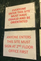
To enter this construction site you need a helicopter:

How do you “sign at 2nd floor first” without passing through the ground floor? I’m giving the sign-writer a pass on “everyone enter” and “be orientated.”

Last one comes from a restaurant for people with extra-strong teeth:

Lacking hyphens, the four adjectives run together and provide interesting food for thought, which is the only sort of food they’re offering, according to this sign. Is it a batch-market or market-fresh? I don’t know or care, but I would prefer not to eat plates, even if they’re made from local clay, scooped out and kiln-fired at the height of the pottery season.

Year End Thoughts

With only a few days left before 2018 hits the history books, I’m offering some holiday advice, culled from signs I see in the few NYC stores that haven’t been wiped out by e-tailers.

First, party hearty, but maybe not this hearty:

I took this photo in early December.

I won’t quibble about “Opening on January 2019.” If they are “close” because they’re sampling wine for most of a month, the mistaken preposition is understandable, if not inevitable.

Next, shop locally. I wasn’t kidding about the effect of online commerce on the city’s landscape, and from what I’ve read, the same is true in suburban and rural areas. I’m planning some purchases here:

You never know when you’re going to need an exclamation point!

I don’t wear contact lenses anymore, but I may stop by for new glasses and a couple of spare punctuation marks. A store with a sense of humor deserves to stay in business.

Last, a resolution for the year about to begin:

Grab that handle!

Judging by the headlines, 2019 will be bumpy. To make the world a better place, we all have to “PULL A LITTLE HARDER.” Actually, a lot harder. Happy New Year!

Twenty Something

Regarding the title of this post: “Twenty,” because that’s the number trending on signs around town. “Something,” because the message of each of these signs means something. I just don’t know what. Take this sign (please, please take it away):

I like a discount as much as the next person, but I’m a little hesitant to buy a “damaged boxes item.” And no, there was nothing under or near the sign to give me context. No damaged boxes, no item.

Here I know what they’re selling, sort of, but there’s still a problem:

Actually, several problems. Once you say “Coca-Cola,” doesn’t that narrow things down, making “beverage” redundant? Are there Coca-Cola sandwiches? Cookies? (Forget I asked. I don’t want to know.) My real issue is with “200Z,” which looks like a serial number. Given the nearby illustration of more sugary beverage than anyone should ever drink, I’m assuming that “200Z” needs a space, as in “20 OZ,” the abbreviated form of “20 ounces.”  I’m not sure whether the pizza crust and sauce under the pair of cheese slices are included in the $5.95 price, but at least the store inserted the hyphen correctly.

I saved the best (actually the worst) for last:

If you hope to meet a regular customer, your odds are 4 out of 5, I guess, because  “today” has “20% new clients.” Actually, new “client’s.” I was tempted to erase the hyphen with my sleeve, but I can’t spend all day deleting apostrophes from NYC signs. I have better things to do, like figure out what the shop offers. The part I glimpsed through the window left me clueless. Besides, the sign may be referring to something belonging to the 20%, in which case the possessive is appropriate.  The only problem, aside from the fact that there’s no indication of what’s possessed, is that the apostrophe should appear after the letter S (the plural form), because “20%” implies more than one person. They can’t chop up one person!  I think at least twenty-something percent of us can agree on that point.


Happy Halloween!

Before or after you hit the trick-or-treat trail, take a minute to enjoy  these holiday photos. This one comes from my friend Milton:


“Punking” seems perfectly suited to the “trick” part of the Halloween slogan, don’t you think?

Mary Shelley’s famous novel, Frankenstein, is also a good fit for this holiday. The Morgan Library has a fine exhibit celebrating the 200th anniversary of the monster, who, by the way, has no name and is actually much less monstrous than most of the human characters in the book. (Frankenstein is the name of the doctor who sewed body parts together and animated the creature.) I learned a lot from the exhibition, including this information about early theatrical performances of the classic work:

Leave it to Mary Shelley, inventive in so many ways, to add an apostrophe and the letter S to a row of hyphens to create a possessive form of “the unnameable.”

Once Halloween is over and you’re fighting sugar rush and paying dental bills, you might plan for another holiday, one that tends to be stressful. Show this sign — sent by my friends Pilar, Naomi, and Aracelly — to any of your unruly offspring:

“Behave or I’ll drop you off.” Simple but effective! But before your kids call Children’s Protective Services, be sure to explain that you’re just punking them.

I Give Up

After decades of bellyaching about the sad state of NYC signs, I have officially given up  — on some issues, not on all. Grammarian in the City will no longer object to the following:

As far as I’m concerned, BOGO all you want. I once thought that the concept of “buy one get one” was an unnecessary statement of the standard deal between buyer and seller. But now I see that most BOGO-users are too busy surfing social media to add an “F,” for “free.” Or maybe they think that BOGOF sounds like a mediocre brand of caviar. I commend this sign-writer for specifying the terms of the deal, spelling out “buy one get one” for “50% Off,” though strictly speaking the sign should read “BOGAOF50%O” (buy one get another one for 50% off). I concede that such a sign resembles the kind of password people concoct and promptly forget. I will, however, raise an objection to “tight.” I  prefer to cover both legs with “tights,” not just one with a “FREE tight.” And $75 is a little steep, don’t you think?

I’ve also thrown in the towel when it come to hyphens:

My first glimpse of this truck made we wonder whether Bunsen burners are prone to out-of-control blazes. If so, I thought, there is certainly a need for “scientific-fire prevention.” But perhaps this company pursues customers who prefer that the laws of physics take priority in battling flames? That meaning would call for “scientific fire-prevention.” Whatever. I’m done with fulminating about hyphenating.

Nor will I say one word about the silliness of this sort of sign:

Okay, just a couple of words: Is there anyone who believes that amateurs rent stores, buy equipment, and have signs painted so that they can repair “hand-bags,” zippers,” and “luggage”?  Judging from the trend to specify “professional” dry-cleaning, barbering, and other services, I guess the answer is yes. No matter. I don’t care. I can even live with this sign’s reference to moribund footwear (“dying” not “dyeing”).

Inaccurate acronyms, missing hyphens, and dead shoes:  This “professional” grammarian has given up on them all.

Punc. Puzzles

What governs whether a sign-maker has room for letters and punctuation? Font? The size of the sign? I’m going for chaos theory, based on these signs. The first is from the “Dept of Transportation”:

Somehow “ped” got a period, but “dept” didn’t. Both are abbreviations, “ped” being the shortened form for “pedestrian” and “dept” for “department.” In case you’re wondering (actually, despite the fact that you’re not wondering at all), I should mention that this NYC “dept” isn’t consistent when it comes to punctuation relating to walkers:


Maybe the plural “peds” seems different to the dept? Grammatically, it’s not.

Not only “depts,” but also building owners get creative with punctuation:


Neither of the two sentences on this sign ends with a period. Also, “owners” should have an apostrophe, before the s or after it, depending upon how many people own the bikes. I gave up the apostrophe battle a long time ago, so I won’t dwell on that issue here. I do wonder (a) how the landlord can figure out who owns a bike and (b) exactly how the “expense” is collected. I’m betting this sign is an empty threat. (Also ineffective, given the number of bicycles that have nearly run me down on New York sidewalks. What’s the dept doing with the time saved by ignoring punctuation rules?) I also wonder about the criteria for capital letters in this sign. If standard rules for caps had been in effect, only “No” and “Removal” would qualify (first word of each sentence), as well as the “Ps” in the title, “Private Property.” If the caps were for emphasis, why is “expense” in lower case?

Another:

I understand that consistency is difficult to achieve in, say, a 200-page document. But if you’re working with only two sentences, you ought to be able to spare a period for each or omit the punctuation mark entirely.

Last but not least:

Okay, no period at the end of this sentence: I’m used to that. But I can’t find any reason for a comma before the conjunction “or.”  For that matter, I can’t find a reason for the text as written. Why not just say “DO NOT FEED BIRDS”? Theories welcome. Punc also.