Category Archives: Picky Punctuation Points

How punctuation changes or destroys meaning

Goodbye, 2022

My last post of the year, written during this busy holiday/winter-storm/school-vacation season. First up is a cafe menu. Pay attention to the third-to-last line:

CAESAR CONTAINS NUTS, does he? What a clever way to indicate that power corrupts! Or maybe it’s an indictment of Nero, Julius, Augustus, and other CAESARS?

Next is a message from a dry-cleaning shop. It’s a poor quality photo, so I’ll reproduce the words: BUSINESS IS MOVING FROM JUNE TO A NEW PLACE.

A NEW PLACE? Like July or October? What was wrong with JUNE? Too many weddings and graduations?

Now to Seatac Airport in Seattle:

It took me two days to decode this sentence, partly because I lose my mind when I’m traveling and partly because there’s a missing comma. I kept reading the message as FIRE ELEVATORS, a noncombustible (and most likely nonexistent) subset of ELEVATORS. I think we can all agree that IN CASE OF FIRE, signs with instantly obvious instructions are preferable. (With that in mind, I’d be happy to proofread this airline’s signs in exchange for a free trip. If you’re an executive with Alaska Airlines, leave a comment and I’ll get back to you.)

Finally, a van parked on my block:

Wouldn’t it be nice to hire this company for the stock market? The economy could use a BOOM right around now.

BOOM or not, I wish you a peaceful, joyful, healthy 2023.
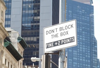
Oddly Specific

I usually gripe about vague signs, but today I direct your attention to some oddly specific notices, such as this one:

I’m not hugely surprised that dogs are excluded, because an expanse of lawn (in this case, a soccer field) would be a nice place to let Fido off the leash. But would people actually take cats there? If so, I’d like to know how they get a leash on a cat without incurring stitches for the leasher and the leashed. And what’s with the pot bellied pigs? If I were an iguana or a llama, I’d feel left out by this sign. And if I had a pot-bellied pig, I’d never exclude the hyphen.

Another exclusion:

Do I have to point out that ice cream is, in fact, food? For some of us, it’s a major food group. Also, why single out ice cream? Was this store owner once traumatized by mint chocolate chip? Struck in the eye by a cone of rocky road? On a diet?

At least the comparison is logically correct in this sign:

I do wonder about the comma. Grammatically it’s not necessary (some would even say it’s wrong), because the conjunction or doesn’t connect two clauses. To me, the comma sounds a bit defensive: I’m not anti-pigeon! I’m anti-other birds too!

One more bird (sort of), courtesy of my friend Catherine:

This image has an empty alt attribute; its file name is cat-food-Catherine-e1633093629444-350x260.jpg

So glad the label is clear! Now I know that I’ll have to shop elsewhere for outdoor chicken.

Apostrophes, Sigh

What is it with apostrophes? They show up when they aren’t needed and go AWOL when they are. Here’s an example from the first category, in a blurry photo I snapped from a moving car:

Unless the HOUSES & LAND belong to a man named JOHN BUY, this apostrophe interrupts a perfectly good verb.

Another unnecessary apostrophe, in the plural noun Mondays:

Whoever made this sign tried a tactic I’ve often seen students employ: miniaturizing the punctuation mark. The student hopes that if the word needs an apostrophe, the teacher will see one, and if it doesn’t, the teacher will see an untidy smudge. I should note that hedging a punctuation bet this way never works, in class or in signs.

Now for the AWOL Department. This sign, in an elevator serviced by a major airline that should know better, lacks an apostrophe:

There are more problems with this sign than writing FIREMANS instead of FIREMAN’S. First of all, I sincerely hope that more than one person would respond to a blaze in an airport. A blaze anywhere, for that matter! Thus I have a problem with FIREMAN, a singular noun. Second, the sign has a gender problem. If I were a FIREFIGHTER (a more accurate and inclusive term), I’d be tempted to thwack this sign with my extinguisher and put a dent in FIREMANS.

This one is in a category all by itself:

I wonder what sort of goals a numeral can have. Does 1 aspire to become 2? Aim for 10? Perhaps 1 aspires to a fancier font?

Maybe there’s a 1 somewhere in the world striving to curtail gun violence. I can get behind that last goal, for sure, and you probably can, too. If only the shop displaying this sign could help us refine that goal and create an action plan. That would undoubtedly be in EVERY 1’S best interest.

Quiz Time

Why? Such a simple question. Unfortunately, the answer may be anything but, especially when it comes to signs, as in “why did they write that, in that way?”

My friend Amy sent this photo:

There’s some punctuation missing from the sentence beginning with wildlife. A comma after area would directly address wildlife, telling them to be cautious. That interpretation gives rise to two questions: (1) Aren’t wildlife instinctively cautious? and (2) Can wildlife read? Another possibility is that a colon went AWOL from its spot following area. Reinsert it and the sentence becomes a command to be cautious, addressed to whoever is supposed to STAY OUT. That’s more logical but probably ineffective, because some forms of wildlife (the human variety) are capable of interpreting a simple prohibition as a dare. Side point: can somebody please explain the rationale behind the capital-letter and period distribution?

I spotted this sign in a botanical garden on the east bank of the Hudson River:

The Shop is stocked with unusual items, and I’m always interested in checking out a sale. I didn’t buy anything during my visit, though, because I spent my time wondering why at is italicized. Also, why at? What’s wrong with The Shop in Wave Hill or The Shop of Wave Hill? Even The Shop for Wave Hill makes sense, as this is a nonprofit.

My friend Jacqueline found this message in a fortune cookie she cracked open after dinner at (unitalicized!) our favorite Chinese restaurant:

She pointed out that what is right and what you should do are generally supposed to be the same thing. Right?

I welcome your theories about (or for, on, or even at) these signs.

Obviously! Or Not.

On some of my excursions around New York City, I find signs that are stunningly obvious, the equivalent of a message I once saw on a book of matches: “Warning — may cause fire.” Here’s one such sign:

Does the owner think anyone’s going to pay $26.00 for amateur haircuts & shaves? Professional would seem to be self-evident, given that someone is paying rent, utilities, and so forth to hang out inside and tend to customers’ tresses in exchange for money.

Also obvious is this sign I saw in Midtown:

If you were searching for a satellite, where else would you look? Under the sidewalk grate? Not obvious is what’s holding the satellite. A giant leash? A Star Trek magnetic field? Also, why are they holding it? Send the satellite into orbit, already! Despite the pandemic, rents in New York City are high, and Space is free.

Also unclear is the meaning of this message, which I glimpsed on the side of a van belonging to a cleaning service:

I have always assumed that every doorman in my building showers, with perhaps an occasional bath as a change of pace. That a doorman might opt for dry cleaning never even entered my mind. Now that the thought is there, though, I wonder whether the dry cleaning ticket is pinned or taped on, and to which body part. Actually, on further reflection, I’d rather not know.

One more puzzler, to balance out the pair of obvious signs earlier in this post:

The bar looks old, so I’m not questioning the age of the place but rather the quotation marks around 100, which are most commonly used to indicate a direct quotation. That doesn’t seem likely here. Nor is it likely that the marks signal doubt about the accuracy of the information enclosed by quotation marks, as in We listened to Henry’s “singing” until our eardrums ruptured. The dates show 100 years (2021 1921 = 100). So why quotation marks?

Obviously, I invite you to send me your theories.

Time to Eat

We all like to eat, right? And most of us like to eat right. We do our best to select nutritious and delicious food that doesn’t bust the budget. But finding such food isn’t always easy. Indeed, sometimes figuring out exactly what you’re buying can be problematic. Take a look at this item, which my friend Sean spotted:

What is it with the canine references? A couple of posts ago I showed you a sign indicating a “large bread dog park.” Now someone’s putting pastrami on Snoopy! This label is also evidence of (in my opinion) a culinary crime. Lettuce and pastrami shouldn’t go together on a beagle, a bagel, or anything else.

The next photo comes to you courtesy of last night’s dinner:

The meal was quite tasty, but I did wonder whose hands were involved with my salmon, and how. Handcrafted, my dictionary tells me, means “made skillfully by hand.” Unless my biological knowledge is faulty, salmon make salmon, and fish don’t have hands. Yes, I know the handcrafted part might refer to grilled. In that case I hope the hands wore heatproof mitts. Otherwise those dark stripes on the salmon were . . . well, let’s not go there. I ultimately decided that handcrafted is similar to artisanal (a label I have also seen applied to fish). Both mean “you’re paying too much.”

I did not buy this dessert, but I did wonder what the store was selling, and to whom:

Is this treat intended for an extremely small lover of chocolate? Or is the store informing the customer that the chocolate bits in the sundae are undersized? Maybe the sundae is smaller than the size the store usually sells. The whole thing can be resolved with punctuation: I favor a mini, chocolate-lover’s sundae. Actually, I favor a maxi sundae, but I shouldn’t indulge.

I hope this sign, like the previous one, has a punctuation problem, because if it doesn’t, someone better call the cops:

That’s it for today. Time to eat!

Punctuation Puzzles

I live in New York City, so irony is my default tone. Thus I’m fairly sympathetic to “scare quotes,” the print version of “air quotes” — punctuation that writers insert to distance themselves from whatever’s inside the quotation marks. The problem is that sometimes readers can’t tell whether the quotation marks indicate a definition (as they do above), an exact rendition of someone else’s words, or an eyeroll. Take this sign, for example:

I’m not sure why NO appears inside quotation marks. If these are scare quotes, the signwriter is saying, “Cyclists, you are not supposed to park here, but [wink wink] you will anyway and I won’t stop you.” It’s also possible that the signwriter may be quoting someone: “Don’t blame me! The owner said NO.” Putting aside the punctuation issue for a moment, I still don’t grasp the intended meaning. Is the sign protecting cyclists (“There’s a HAZARD here for you!”)? Is it trying to safeguard pedestrians, who may trip over a parked bike? Keeping cars and bikes separate? Inviting cyclists to leave their bikes because there’s NO PARKING HAZARD? I can only speculate.

Nor can I determine the function of the quotation marks in this photo, sent by my friend Ellie:

Frankly, I have no idea why quotation marks appear in this sign. Nor do I know why there is an ellipsis (three dots) after flowers. Unfinished thought? An attempt to create suspense? I’d take a scalpel to this sign, excising two dots, both quotation marks, and one exclamation point. Then I’d use the scalpel to cut myself some flowers.

Another sign suffering from excess punctuation:

Here’s what I know for sure: the restaurant needs HELP in the KITCHEN. It also needs HELP in signwriting. The business is seeking a COOK and . . . well, I’m not sure who else. There may be two spots open, one for a DISHWASHER and another for a DELIVERY person. The forward slash in DISHWASHER/DELIVERY implies that one employee is supposed to wash a few pots and then dash out with a DELIVERY. Three exclamation points convey desperation, though perhaps not enough to raise the salary being offered to a potential COOK, DISHWASHER and DELIVERY person. PETER, if you see this post, please clarify. Readers’ theories also welcome!

Pondering Punctuation

Can we agree to give up on apostrophes? All together now: pry the key off the computer, excise the concept from your brain, and resolve not to write anything with a curved mark hanging next to a letter. Can you feel the relief? Never again will you have to critique a sign like this one:

This is not my dentist, but if I were in search of a new one, I would not rule out this fellow because the plurals are (gasp) written with apostrophes. Inserting punctuation is not the same as filling a tooth. Besides, apostrophe-less words are perfectly clear, most of the time. Take a look at this helpful sign from a clothing store:

On reflection, not very helpful. The sign is on the ground floor, surrounded by racks and tables displaying tee shirts and shorts for nonhuman life-forms (I can only assume, since the sign indicates that women’s, men’s, kids, and a single, solitary baby are accommodated downstairs). Back to my apostrophe point: If women’s were womens and men’s were mens, would shoppers be any more confused? I do admit that the lack of consistency is problematic. Anti-apostrophists like me could delete two bits of punctuation, and pro-apostrophists could add them. Both groups could pluralize the youngest age group.

This sign is also confusing, not just because of its punctuation:

I can ignore the PUSH / DO NOT PUSH issue, because (a) there’s a pandemic and (b) removing a decal from glass is not fun. What I can’t ignore is the !!! in the middle of a sentence. An exclamation mark is an end point. You get there and you’re done, unless you’re Panic! At The Disco, a band with an internal exclamation point that, perhaps not coincidentally, broke up a few years ago. Also, no one needs three exclamation points, especially now. We’ve had enough excitement for this millennium, thank you very much. Revised, much improved versions: Please DO NOT PUSH THE DOOR! or Please, do not push the door.

Perhaps the previous sign could send two of its exclamation points to the one below, sent by my friend Sean:

I would feel much more comfortable with an exclamation point after hunting. Even two. Much safer for everyone. Speaking of safe: please stay that way. Covid is still out there!

May I Ask a Question?

Four questions, actually, all simple, all based on photos from the past year. Free subscriptions to this blog to anyone who answers all the questions correctly. (For legal reasons, I should probably point out that subscriptions to this blog are always free.) Okay, here’s the first:

QUESTION 1: What did the deceased former Treasury secretaries call for?

Ready for number 2, which my friend Don sent?

QUESTION 2: Do employees check whether the kids really have gas before handing over free food? If so, how?

Moving on:

QUESTION 3: Can we ever trust Dovere’s pool report again?

Last one, which I admit is somewhat personal because I wrote the book on the left:

QUESTION 4: What logical thread unites these three items?

I am looking forward to your answers. Stay safe!

Signs of Covid, Part 1

A year in, it’s become clear that symptoms of Covid-19 include well intentioned but poorly executed signs. I have collected quite a few, so I’ll spread them over a couple of posts. The first one is a bit late, but I’ll post it anyway because Valentine’s Day should last as long as possible this year, which has been sorely in need of good feeling:

Here’s another emotion-packed message, not quite as upbeat as the previous:

This was on the window of a doctor’s office. I was tempted to call to say that I’d agree to STOP!!!! if the doctor would agree to drop three of the exclamation points. Well, four, because the one after NAME isn’t necessary. Maybe it can be recycled into an apostrophe for CANT?

The previous sign is a little rude, but at least it asks you to control yourself, not others, as this one does:

I have great sympathy for the struggling restaurant industry, but I don’t see myself (or any diner, in fact) pushing people apart who venture too close to each other. It’s my responsibility to MAINTAIN A DISTANCE OF 6FT from OTHER GUESTS, not BETWEEN. Nor should this responsiblity fall to the waiters. Diners, you know the rules. Please follow them. Or, as the person who fashioned the second sign in this post would put it, BEHAVE!!!!