Category Archives: Now trending

Observing and all too often criticizing language trends

Help Wanted. Please!

Still summer, still hot, still trying to figure out what some signs mean. A little help, please!

I understand “Credit and Non-Credit,” “Online,” “Leadership,” and STEM.  (In case you aren’t familiar with the acronym, that’s “Science, Technology, Engineering, and Math.”) But “Location-Based”? Last time I checked, everything was in a location. Are students getting credit for thinking about where they are? I imagine this advertisement, which is from a university with an excellent reputation, refers to study abroad or in locations that invite scientific or sociological research (e.g. Antarctica or a rainforest). If so, say so, I thought. Then I tried to reword the line and came up empty. Suggestions?

Here’s a physical/verbal oxymoron:


The posted bill (which the dictionary defines as “a written or printed notice”) outlaws itself. I  spent some time wondering how to get around this problem. You could say, “Post no other bills,” but that sounds clunky and invites reactions such as “What’s so special about your bill?”  A few weeks later I saw the same words stenciled on a wall. Does a stencil count as writing? Is a non-paper bill a bill? No idea. Thoughts welcome.

And there’s this beauty from the New York Times:

The verb “refund” is transitive; that is, it takes an object. To whom is the bank refunding “Mr. Kemm”? Does he come in a large version of those bill-shaped envelopes you get when you withdraw a lot of cash? Is he shrink-wrapped, like (I imagine) deliveries from the treasury? Speculation invited.

I spotted this problem on a menu sign in the cafeteria of the Metropolitan Museum of Art. I couldn’t come up with a solution:

I was fine with the first two lines and the last, but the third one stumped me. “Bolognaise” (often written as “Bolonese”) is a meat sauce. But before I got to that word, I pictured “house-made beef” and immediately wondered where the Met was raising its cattle. In those mysteriously roped off galleries? Hidden in the basement and taken out at night to graze in Central Park? My first thought was to drop “beef” as unnecessary information. But I did a little more research and found that Bolognaise sauce may contain beef or pork, or, for all I know, ostrich or aardvark. So “beef” is actually essential information. I spent several hours trying to reword the sign to avoid the cattle-on-Fifth-Avenue issue. (Yes, I really should get a new hobby.) My best answer was a comma after “house-made.” I could also envision a hyphen (beef-bolognaise). Neither satisfied me as much as the pasta, which was quite good. Chefs, how would you word this sign?
Puzzles

Although it’s still July, I can’t help feeling that we’ve hit the dog days of summer, which should show up in late August. Maybe it’s just me. Or climate change. Regardless, it seems like a good time to present some puzzles to take your mind off the heat. Here we go:


First of all, this sign does not include the word “free,” so it isn’t saying that if you buy one shoe, the store will throw in another one without an additional charge. I don’t need to point out that in the non-shoe world, buying one thing usually results in your getting one thing. An upsetting possibility is that shoe stores are beginning to follow the playbook established by airlines: Charge a basic rate that includes almost nothing, and then add fees. “Want the matching shoe? Upgrade to the pair rate!” If that’s the case, I think I’ll hop.

My friend Catherine spotted this sign:


Over several glasses of wine, we decided that this place either offers head-to-toe service or caters to clients with hoof-and-mouth disease. Other theories welcome.

Then there’s this sign:


I didn’t realize that Bento Boxes were “Irish to the Core.” I may have one with a glass of Japanese-to-the-Core Guinness.

Last one:

The truck handle underlines the crucial word, which seems to promise 24-hour service if you need a stringed instrument (the “Viol”) removed. The puzzle: There’s a period after “Viol,” implying an abbreviation (most likely candidate: violation). But there’s also a red dot between “Viol.” and “Removal,” separating the two concepts. Why would a company offer “violation” (abbreviated or not) to its customers? You figure it out. I’m going out for some iced coffee. Or an Irish bento box.


Summer Slump

Summertime, and the living is sort of easy, depending on who you are (kids v. parents) and how well your air conditioner works. Most of us slump in the summer, because it’s too hot to do much of anything else. These NYC signs may offer some relief for slumpers, or at least food for thought. For example:


I won’t point out that this food market feels the need to state that it’s “open to the public.” Not for me to ask “what else would it be? a storefront that sells food only to family members?” Nope. Not a word. What I am interested in is the “daily action station.” I’m pretty sure that would come in handy for . . . well, I don’t know. But for something.

Then there’s this one:

My hair turns into a frizz field in NYC’s summer humidity. The sign suggests I turn to “Hairdecor.” Which is, I guess, different from a “hair cut” or a “blowout.” More a complete change of hair furniture than a new sofa pillow. Note the period, which the British call a “full stop.” This term suits the sign’s punctuation because “full stop” implies that “hairdecor” is the end of a story. Once you’ve got hairdecor, you’re done. The next time frizz sends me into a slump, I’ll go here.

But not here:


I don’t need “detox.” Honestly, my main vices are an occasional scoop of ice cream and a binge session of British reality shows. (Try them. Everyone’s nice, and there tend to be a lot of fields with sheep.) Back to the sign: I’m not even sure what the “detox” is supposed to detox you from — the “fresh juice”? the “smoothies”? Nor am I interested in “pre/post work-out drinks,” though I admire the  nicely placed hyphen. I guzzle tap water when I get off my exercise bike. Some may say that’s why I should buy a “life shot.” And perhaps they’re right.

But I doubt it. Regardless of the composition of the “shot,” it promises to hit the purchaser with “life.” My experience is that life gives all of us shots from time to time, whether we want them or not. For free, too. And if you’re lucky, you learn to duck at the right time.

Let’s toast to the arrival of summer, with a shot of whatever you want.

Command Performance, Part I

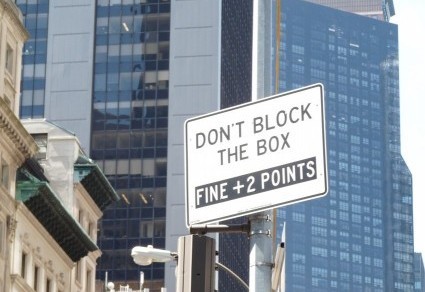
Now trending: signs that command you to do, or not do, something. Also trending: ignoring the signs that command you to do, or not do, something. I found so many examples of this genre that I’m splitting my trove into two parts. I’ll start with my own command: Check these out.


My friend Ellie sent me this beauty, which visually commands you not to bring cigar-smoking, wine-swilling, skateboard-riding dogs into this park. A boomerang may be tucked in there also.

Delivery people have strong arms, right? Good, because this sign commands them to be boxers or construction workers:


I guess if you’re a bicep-deprived UPS, USPS, or FEDEX employee, you’d better bring a phone.

Need a rest? Try this place:


“Enter here” and emerge four months later. No problem! But if you’re driving on the Upper West Side, this sign is definitely a problem:


Not counting the absence of punctuation, the grammar is correct. The meaning? It’s perfect, but “egress”? Really? P.T. Barnum, the 19th century showman and trickster, moved the maximum number of people through his museum each day by posting a sign reading “This way to the egress.” Few equated “egress” with “exit” until they were outside, re-entry prohibited. Which prompts this question: How many New York drivers can define “egress”? And where will they park while they’re googling it? My guess: right in front of the sign.

Where?

Take the Q32 bus between Manhattan and Queens (two of New York’s five boroughs) and you see just how diverse this city is. On a single bus route you find an Irish pub, an Ecuadorean restaurant, a Nepalese shop, and countless other spots that celebrate the residents’ heritage. That makes sense to me. These signs do not:

It’s not that I want to see Brazil’s influence wane, but is there something wrong with American bees? I realize that “Brazilian Waxing” refers to hair removal, but surely most people, like me, don’t know exactly which areas are targeted by Brazilian Waxing as opposed to, say, Canadian Waxing (if that exists). I have glimpsed ads for “European Wax,” but once again I don’t know that continent’s hair-removal conventions. Nor would I like to find out.

Moving on to academics:  A young friend of mine studies, according to the cover of his  textbook, the “Japanese system” of math. Presumably his schoolwork is different from the lessons here:


Silly me. I thought numbers were the same everywhere. Then there’s this store:


My favorite French teacher, Jacqueline, would be the first to tell you that my verb conjugation could be cleaned up, but I doubt this store would help. I’ll be in Paris next month, where I’ll check for stains. If I don’t find any, I’ll consider bringing my garments here for French cleaning.

And what is this business selling? Stoves that do a great job on bratwurst? If so, sign me up.


Last but definitely not least is this exercise regimen, offered at a gym near my home:

I googled “Russian Kettlebells” and discovered that (a) they exist and (b) they’re handheld weights and (c) they’re the subject of much controversy. (Is anything connected with Russia not controversial these days?) Apparently some people swear by American Kettlebells, and others are faithful to the Russian version. I have no intention of trying either exercise, but I do wonder whether patriotism is part of the equation. Maybe if I’d studied Russian Mathematics I’d know.

How to Speak Real Estate

In a previous post, “(Truly Real) Real Estate”  (http://www.grammarianinthecity.com/?p=783),  I went over the basics of how to speak the NYC dialect of Real Estate. I explain, for example, that “cozy” means small, and  a “charming” apartment hasn’t been renovated in fifty years.

For anyone moving on to the intermediate level — perhaps members of Gen X, Y, or Z looking for a spot in one of the city’s boroughs, here’s lesson two. Similar dwellings move up the price-ladder in this order:  “apartments” are cheaper than “residences,” which in turn cost less than “homes.” My personal favorite, “boutique,” is the most expensive. In the commercial market, the price of “an opportunity” is much more than what you shell out monthly to the landlord of a “store for rent.” Furthermore, assume that deadlines are open to interpretation:


I cut off the right side of the photo because I don’t like to give real phone numbers. I do like to give real dates, unlike the sign, which promises that the “residences” (price alert!) will be “Available Fall 2017.” I took the picture three days ago, in the spring of 2018. Judging from the scaffolding and debris scattered around, not to mention the “mandatory hard hat” sign, spring of 2019 is more likely.

And count on hyperbole. If a building is advertised as being “steps from Central Park,” the statement may be true only if you take about a thousand steps and have fairly long legs. (I actually saw this phrase on an ad for a building on my block, which is a brisk fifteen-minute walk from the park.)  Another hyperbole: a “home” (price alert again) advertised as on the 20th floor may actually be much lower. If you’re in an elevator on the way to an open house, notice whether the buttons skip, say, floors seven through nineteen. Then do the math.

But those are minor quibbles. Anyone can be late or exaggerate, right? Redefinition, on the other hand, is another matter entirely. Take a look at this ad:

For readers who have lived only in houses, I should explain that a “studio” is a one-room apartment. Except if it’s the studio advertised on this sign, which somehow has “2 room.” The hyphen, by the way, is missing in the compound adjective, “two-room” or, in this sign, “2-room.” (It’s probably hiding, too embarrassed to be part of this ad.)  The accompanying photo shows a large, bare room with no visible doors. Maybe they’re counting the bathroom as a room? Or they assume you can hang out in the basement with your bike, designating the storage area as a living room? Perhaps they believe you will pitch a tent in the “communal garden,” which, because we’re talking about New York City, could possibly have plants but may also be a patch of concrete without a roof.

Lesson for the NYC house hunter: learn to speak our real-estate dialect, and, as always, buyer beware.

Think Before You Name

I’ve been reading a lot about Generation Z recently. Also known as “post-Millennials,” Gen-Zers were born between the ’90s and the early ’00s.  Speaking of the ’00s, I remember debates about what to call those years (2000 — 2009). I rejected “the zeros” but liked “the oughts,” perhaps because I spent most of those years thinking about what I ought to do and then not doing it. Like staying on topic, which I always ought to do and just now did not. Anyway, back to Generation Z: I don’t care much about the traits and careers of Generation Z. I do care about the name. Generation Z came after Generations X and Y. Where do we go from here? Someone started us close to the end of the alphabet, undoubtedly rebelling against the parental generation, the Baby Boomers. (You notice that group had a sensible name. World War II ended and boom, a bunch of kids were born. A big bunch. Enough to make a boom.)

So what’s next? Maybe there will be a return to the beginning of the alphabet (Generation A, which will probably have too much self-esteem because of the label) or doubles (Generation ZZ, which will perceive a license to sleep wherever they please). I can also envision computer terminology creeping into the picture: Generation Z.2, anyone? They’ll all be wired, anyway.

Lack of foresight in assigning labels, by the way, isn’t confined to generation-naming. Art fell into the same trap with the term “modernism,” a movement that began in the late 19th century and continued through the early part of the 20th — not exactly antiquity but also not what I’d include in a statement about “modern times.” Ditto for post-modernism (mid-1980s onset). I guess everything after that is post-post-modern. Quick quiz: How many “posts” does it take to make autocorrect self-destruct?

My conclusion: Think before you name. Think before you do pretty much anything! Otherwise you end up with a mobile ballet studio


or a name that has no place to go.

Bus Woes

Aren’t buses annoying? First of all, there’s that plural. The usual phonetic rules call for a double “s” in the plural, and some people do indeed write “busses.” “Buses” is more common, yet for some reason I feel slightly wrong every time I write it. Then there’s the actual bus, which never comes on time because it’s waiting for a quorum. Passengers, that’s the real reason you see four buses pull up at the same time. Unless there’s a group of four, the bus-run can’t begin. Finally, there are the silly signs both inside and outside of the vehicles. For example:


It’s worth noting that NYC city buses (except those on the airport route) don’t have luggage racks. But even if they did, are there people who need to be reminded not to climb the walls and sling a leg over a metal bar? Actually, scratch that question. This is NYC, so the answer is probably yes. I do wonder why “Luggage Rack” is capitalized. Normally, generic nouns are written in lower case. Perhaps adding capital letters makes the nonexistent item more real.

Moving on:

This one was on a tourist bus, so warning people not to slide the roof or throw packages is probably a good idea. People’s brains tend to hibernate when they’re on vacation. My favorite part of this sign is “frequencies.” I’d expect a singular there, because the time period between events varies, not the time periods. “Frequencies” makes me think of radio stations and, vaguely, astrophysics, which I can think about only vaguely because I have no actual knowledge of the subject. Also, why “approximately”? Isn’t that implied by “vary from 8 to 15 minutes”?

I used this photo in another post (http://www.grammarianinthecity.com/?p=2159) but I can’t resist repeating it because it’s such a good example of the “bizarre bus sign” genre:


DNA. Good to know. If you want to maintain your privacy, try not to shed any cells while riding. And if you wish to explore your genetic heritage, this bus is for you. Happy riding.

Calling All Creatives

Words slide from one part of speech to another all the time. How else could I meet some Yankees (noun) or watch Yankees baseball (adjective)? Nor is it rare for words to pick up new and fanciful definitions, though I confess that the first time I see the unexpected, I tend to assume the writer is wrong. Alas, pride does indeed go before a fall, because often I am wrong and what I thought was an error turns out to be a creative expression or a specialized usage.

Are these sign-writers visionary, knowledgeable, or grammatically inept? I’ll let you decide.

Man shirt?


The usual expression is “men’s shirt” or, in an apostrophe-stricken way, “mens shirt.” “Men’s” with the apostrophe is a possessive noun. Without the apostrophe it’s a mistake.  “Man shirt” turns “man” into an adjective. The dictionary allows for “man” as a noun (the man at the counter), a verb (to man the barricades) or an interjection (Man! That was awesome!) True, I don’t flinch at “man cave” (not at the wording, anyway). Perhaps the sign-writer didn’t want the correct but trite “men’s shirt.” But how to change it? “Male shirt” endows the clothing itself with gender.  “Shirts belonging to men” is too long and often inaccurate, as lots of people who aren’t men like the button-down look. “Masculine shirt”? That seems to rely on outdated stereotypes. Maybe “man shirt” isn’t so bad after all.

Moving on:

In my ignorance I was ready to impose an “unauthorized part of speech” penalty — until I looked up “creative” in the dictionary, which enlightened me to the fact that “creative” can be a noun applied to people who, well, create for a living: writers, artists, composers, and so forth. Apparently I’ve been a “creative” for decades and never knew it.

Last one:


“Availability” as a noun is pretty common, but usually in the abstract sense: “Her immediate availability makes her the ideal candidate for Fire Warden, because two million acres are aflame and another million at risk.” But every dictionary definition of “availability” begins with “the quality of” or “the state of,” not “the place where.” On the sign, “availabilities” is a stand-in for “property you can rent if you have enough money.” (A little research into real estate prices showed me that “availabilities” are more expensive than “space for rent.”) Before I leave this sign, I have to address the meaning of “RSF.” I found a site listing 53 meanings for this acronym. I scrolled past “Royal Scots Fusiliers,” “Resource Selection Function,” “Rivista di Studi Fenici” (Journal of Phoenician Studies) until I arrived at “Rental Square Feet,” which seemed more apt than Scots, ecologists, and Phoenicians.

This whole post, by the way, arose from a New York Times article that quoted the phrase “negative effectives” from a judge’s decision.  Given that an “effective” is a “soldier ready for battle” and the ruling was about the military, the phrase might have made sense. Sort of. Then I checked other papers, all of which referred to “negative effects.” Sometimes a “new usage” isn’t creative or specialized. It’s just a typo.

Moral of the story (and note to self): Check before you scoff.

Sspeling Erorrs

I don’t usually bother with spelling mistakes, but when they appear on expensively produced ads, it seems to me that someone should have proofread before printing. Or before handing the finished product over to the customer. Or, at the very least, before hanging the sign on a store window, truck, or sandwich board.

Whether to double a letter or not seems to attract (atract?) errors like iron filings to a magnet (fillings to a magnett?):


Does this shop offer feline treats (mice, catnip, permission to snooze on a sofa that’s usually off-limits)? Or does the store host gossip fests, where guests can be as catty as they please?

Maybe the shop that does “cattering” should lend one of its Ts to this food cart:


I leave aside the issue of eating lunch at 10 AM or 4 PM, given that New York is the city that never sleeps and meals roam around the clock dial like sleepwalkers in a kitchen. Nor will I focus on the random capital letters, though I can’t help wondering whether lunch Time is supposed to reflect the eternal nature and importance of Time or whether the expression refers to a magazine. Instead I’ll confine myself to the meaning of the first line. Is the food cart offering to have the employee in charge of placing rice on the plate accompany you while you eat? And is Free Can Soda a call to action? I do like that sm matches content to form. The abbreviation sm is indeed small.

I don’t want you to think that whether to double the letter T is the only problem out there. S comes with stress in these signs:


Had I a marker and not an aversion to graffiti, I’d remove the extra S from “tresspassingin the second sign and add it to kind in the first. While wondering whether the second sign banned a hair-exchange app, I’d also delete the extra f from proffessional  or get rid of the word entirely. I mean, who else works in a tailor shop? Amateurs? Hobbyists? Not for those prices they don’t.

Now if only these stores would shell out a little cash for some proffessionnall prooffrreadding.